Triple Whale’s 2025 e-commerce benchmarks put the median conversion rate for Luxury & Jewelry at 0.9%, the lowest of any category they measure. That number is what the category as a whole looks like. We have audited fine jewelers whose websites are well under it. Some, while running real paid traffic, convert below 0.1%.
The reason is almost always the same. The fine jewelry site is built as a brochure, not as a revenue-generating asset. It looks fine. It loads (slowly). The hero is a stock photo of a stranger’s hand. The product pages are catalog descriptions pulled in from a third-party vendor that ten other jewelers also use. The checkout works, technically, in the sense that you can complete a purchase if you are patient. The buyer is not patient.
This is part four of our 2026 fine-jewelry operating series. Part one was the high-LTV advertising playbook. Part two was the first 30 days of a fine-jewelry Meta ad account. Part three was AEO for Shopify jewelers. This one is fine jewelry website design: the operating playbook for a site that actually closes online sales, instead of being the bottleneck that throttles every other channel you spend on.
The fine jewelry website is the conversion bottleneck on every other channel you spend money on. Shopify is the right answer the vast majority of the time, but generic paid themes ceiling the quality the site can deliver, so we build headless or custom themes. The truth most jewelers do not want to hear: product photography and video do most of the work, and catalog curation matters more than inventory volume. Trust signals close the buyer. Speed and a clean checkout keep them. Fine jewelers deserve fine websites.
IYour fine jewelry website is probably the bottleneck on every channel you are spending money on.
Before you spend another dollar on Meta, Google, or AEO, run this test on yourself. Pull up your site on your phone. Pretend you are a buyer who just saw your ad on Instagram for the first time. Walk the path from ad-click to purchase. Add an engagement ring to the cart. Get to checkout. Enter a real card. Complete the purchase.
If at any point you hesitated, got confused, lost your place, or thought “I would never actually buy a $4,000 ring like this”, you have found your bottleneck. Every other channel you spend money on funnels traffic into this site. If the site converts at 0.4% instead of 1.2%, you are paying for three times the traffic to land the same revenue. That is not an advertising problem. That is a website problem dressed up as an advertising problem.
A useful clarifier about “good” conversion rates for fine jewelry. A 0.5% conversion rate can be excellent for one jeweler and a 1.0% conversion rate can be unprofitable for another. The variables are AOV, traffic source, and offer. A jeweler with a $12,000 AOV and mostly direct-traffic returning buyers converts very differently from a jeweler with an $800 AOV and cold paid social traffic. Chasing a generic “good conversion rate number” is the wrong question. The right question is: is the site driving a meaningful amount of online conversions and bringing in genuinely new customers, or are you relying on visitors to come from the site into the physical store to actually buy? If it is the latter, the site is functioning as a fancy brochure and is a structural bottleneck that needs to be fixed before any further spend makes sense.
Most jewelers treat their website like a brochure instead of a revenue-generating asset. Fine jewelers deserve fine websites. What follows is the operating playbook for building one.
IIThe Punchmark teardown, web edition: 5,000 monthly visitors, conversion rate under 0.1%.
In part two of this series, we told the ad-spend half of this story. Here is the web half, because the website was actually the larger problem.
The jeweler had a site built by Punchmark, a vertical-specific platform for jewelers. We launched Meta ads. The top-of-funnel signals looked good: opt-ins, browse depth, repeat sessions, adds to cart. Then we looked at the conversion data. The site was pulling 5,000-plus monthly visitors and converting under 0.1%. Not under 1%, under one tenth of one percent. We were paying for traffic into a structurally broken funnel.
The site audit found five compounding problems:
- Punchmark did not allow product descriptions or product images to be changed on items pulled in from third-party vendors. This is absolutely crucial for conversion rates. The buyer is comparing three jewelers’ versions of the same SKU, all using the identical vendor-supplied copy and the identical vendor-supplied photo. There is no reason to pick yours over theirs. Generic catalog content is the most expensive cost-saving decision a fine jeweler can make.
- Product navigation was sloppy. Buyers could not find what they were looking for. Categorization was inconsistent. Filters were partial or broken. The faceted search that fine-jewelry buyers actually use (metal, stone, carat, price band, certification) was either missing or implemented in a way that returned empty results for valid combinations.
- The same items were listed dozens of times in a single category. Each variation, each metal, each size, came up as a separate listing instead of being properly structured as variants of a single product. A “rings” category had hundreds of listings, the vast majority of which were the same handful of rings repeated. The user experience was overwhelming. Decision fatigue killed the sale before it started.
- Add-to-cart-to-purchase drop-off was over 220 to 1. People could browse and add items, but the path from the cart to a completed checkout was structurally broken. The button was there. The flow was not.
- Punchmark also charged $800 a month to manage the site while fixing none of this. Every change request the jeweler submitted took weeks. The contract was structured so that the platform held both the site and the catalog data hostage.
When the audit came back, we pulled the ads. The way Punchmark was operating that site was exactly why I do not run paid traffic to broken funnels. I ethically cannot take someone’s money to run ads into a website that cannot convert the traffic. I refused to keep taking the jeweler’s ad budget until the site was rebuilt on a platform that did not lock the catalog away from them.
The lesson is bigger than one platform. When the platform decides what you can edit, you do not own your asset. If you cannot rewrite a product description, swap a product photo, restructure a category, or change a variant the same week you decide to, the platform is your bottleneck, not your tool.
IIIShopify is the right answer the vast majority of the time. Here’s why, and the exceptions.
We recommend Shopify to almost every fine jeweler we work with. The reasoning is the same reasoning that has held since around 2018 and only gets stronger every year:
- Payment options are great out of the box. Shop Pay, Apple Pay, Google Pay, PayPal, Affirm, Klarna, all wired up correctly with no plugin gymnastics. High-ticket buyers especially expect financing options without having to call. Shopify hands you that on day one.
- Fraud protection is built in. Shopify’s risk-screening catches more attempted chargeback fraud than most jewelers’ in-house operations ever would. For an $8,000 ring shipped to a freshly-created account, this is real money.
- Checkout flow is one of the best in e-commerce. This is the section that Baymard’s research keeps highlighting (see section VIII below). Shopify’s native checkout outperforms almost every custom-built checkout we have ever audited. There are exceptions, but they are exceptions, not the rule.
What we do not recommend, even on Shopify, is building on a generic paid theme. A theme is a template that thousands of other stores are using, with marginal customization through the theme editor. The site ends up looking like every other Shopify store in your category. The structure of the product pages, the checkout funnel, the cart drawer, the menu, the photo treatment, all of it ceilings at “theme defaults plus some color tweaks.” That ceiling is below what a fine jewelry buyer is comparing you to.
We build either headless Shopify or custom themes, depending on the project. The reason is the same in both cases: we are not restrained by generic template constraints. We can decide exactly how a product page looks, how the cart drawer behaves, how the size selector works, how the certificate-of-authenticity download flows. The platform handles the boring critical infrastructure (payments, fraud, checkout). The build handles everything the buyer sees and touches.
The exception case where we recommend WooCommerce is jewelers offering only custom jewelry. The workflow for a custom-only operation, where every “product” is really a configurator + quote + design conversation rather than an inventoried SKU, is structurally different from the workflow for an inventoried-catalog jeweler. WooCommerce’s content-first architecture and looser product-data model fit the custom-only operation better in most cases. It is the right tool for a narrow segment of the category.
One more reason Shopify is now the right answer more than ever: Shopify is also the AI-search e-commerce platform now. We covered this in detail in part three of the series. The short version: OpenAI’s Agentic Commerce Protocol treats Shopify as a platform-level partner, meaning a Shopify merchant’s catalog is already eligible to be surfaced and sold inside ChatGPT with no additional setup. Perplexity has a similar Buy with Pro flow for Shopify merchants in their Merchant Program. If you are on Shopify, you have an agentic-commerce upside that Magento, BigCommerce, and custom stacks structurally do not have. If you are not on Shopify and you sell inventoried product, this alone is becoming a reason to migrate.
IVThe truth most jewelers do not want to hear: the assets do most of the work.
This is the section that makes some jewelers uncomfortable. Read it anyway.
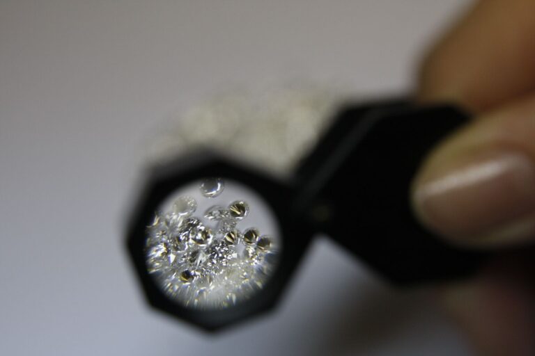
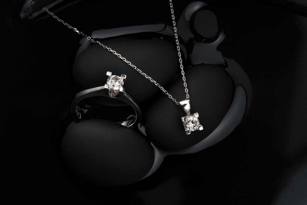
Product photography is non-negotiable for fine jewelry. A $5,000 engagement ring photographed against a beige cardstock backdrop with cell-phone lighting will not sell. It will not matter how clean the website is, how fast the checkout is, how perfect the schema is. The buyer needs to see the ring in a way that makes them confident enough to spend five figures on it without holding it first. Generic stock photography supplied by a third-party vendor and used by twelve other jewelers does not meet that bar. Original studio photography does.
Video is a major conversion bonus. A 360-degree spin of a ring in motion under jewelry-grade lighting communicates light return, fire, sparkle, the things photography cannot. A short on-hand video communicates scale. For high-ticket pieces, video is increasingly the difference between a serious buyer requesting an appointment and a serious buyer scrolling past.
This usually means an in-house photographer or a long-term-contracted photographer. Hiring a shoot-by-shoot photographer for new arrivals produces inconsistent photography across the catalog, which is a credibility leak in itself. The photo style for the engagement-ring category should match the photo style for the bridal-band category should match the photo style for the everyday category. That consistency is what cumulatively reads as “this is a brand with standards.” It requires one set of hands and one set of lighting decisions across the entire catalog.
The cost framing. Most jewelers we audit are underinvesting in photography. Their reasoning is that photography is expensive. The reality is that photography is the lowest-cost-per-conversion-impact investment they could make, and they are leaving the money on the table because the cost is upfront and the return is distributed across every future sale of every photographed product. Not investing in real photography is the most expensive cost-cutting decision a fine jeweler can make.
The catalog-curation point connects directly to this. If your “new arrivals” are just whatever the third-party vendor shipped you this month, photographed by them and described by them, your site has nothing distinctive to surface. The work of being a fine jeweler is not just selling jewelry. It is selecting jewelry with a point of view and presenting it in a way that the buyer cannot get elsewhere. That work has to happen on the site, in the photography, in the copy, in the curation, or the site is just a brochure for the vendor’s inventory.
VCatalog curation: stop listing every variation as a separate product.
The most common Shopify-jeweler mistake we see, after the photography problem, is duplicate-variation listings. A single ring style available in five gold colors and four sizes shows up as twenty separate products in the collection grid. The buyer scrolls past a wall of nearly-identical thumbnails and bounces.
The fix is to use Shopify variants correctly. A ring style is one product with metal-color variants and size variants. The collection page shows the product once. The product page shows the metal-color selector and the size selector. The buyer sees the actual range of choices in context, not a category page that looks like an inventory printout.
This matters for three reasons:
- Conversion. Decision fatigue is real. A category page with twenty thumbnails of the same ring trains buyers to bounce. A category page with five distinct ring styles, each with a variant selector on the product page, gives buyers a clear set of decisions to walk through.
- AEO + agentic checkout eligibility (cross-link Topic 3 section VII). ChatGPT’s Instant Checkout and Perplexity’s Buy with Pro both read variants from Shopify’s product structure. Variants done wrong make the product ineligible for surfacing. Variants done right make it eligible.
- Brand perception. A site that lists 600 “products” that are really 80 products in 7.5 variants each looks like an unfiltered inventory dump. A site that lists 80 carefully-merchandised products with proper variants looks like a fine jeweler.
The bigger curation point is about catalog selection itself. Most jewelers’ catalogs are some mix of in-house designs and third-party-vendor inventory. The temptation, especially for newer or smaller operations, is to just grab everything the vendor offers and list it all on the site. The thinking goes: more inventory, more chances of a sale. The reality is the opposite. The buyer looking at your site cannot tell which pieces you actually chose and which are just sitting there because the vendor sent them. The site reads as “we’ll sell you anything.” That is the opposite of what a fine jewelry buyer wants from a fine jeweler.
The work of curation is deciding what NOT to carry as much as deciding what to carry. Fewer, better-chosen pieces, each with its own original photography and original copy, outperforms a catalog three times the size built on vendor-supplied content.
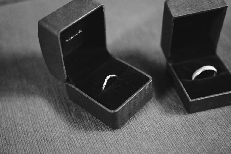
VITrust signals: the site has to make a stranger trust you with $5,000 over the internet.
A good fine jewelry website is one that touches you emotionally and makes you want to purchase, and earns enough trust that someone is willing to spend the money online instead of needing to walk into the store first.
That is two jobs the site has to do at the same time, and most fine jewelry sites do neither well. The aesthetic touches almost no one (because it looks like a template) and the trust earns almost no one (because there is no reason to trust the site over the next site). The buyer ends up bookmarking three jewelers and not buying from any of them.
The trust-signal checklist for fine jewelry:
- A real, signed founder bio. Not a stock photo with a paragraph. A full page with the founder’s name, photo, background, conviction, and
sameAslinks to LinkedIn and other off-site profiles. (We covered the AEO side of this in Topic 3 section V. The conversion side is the same work.) - Authentic reviews that mention specific products, services, and experiences. Not “great experience” five-star Google reviews. Reviews that name the ring, name the staff member, describe the in-store or online experience in concrete language. Ask for those reviews specifically.
- Press placements, named. If you have been in National Jeweler, JCK, The Knot, WeddingWire, Vogue, Robb Report, link them and quote them. The buyer is calibrating whether you are real.
- Returns and shipping policies written in human language, not in legalese. A buyer about to spend $4,500 on a ring online is reading the returns page. If it reads like a contract lawyer drafted it, they get nervous. If it reads like the founder wrote it, they get reassured.
- Live human chat, not an AI bot pretending to be a human. Fine jewelry buyers, especially in the engagement-ring category, ask questions before they buy. A bot that takes ten minutes to fail at answering a basic carat question is worse than no chat at all. A real person available during reasonable hours is a major trust signal.
- Photography that conveys craft, not catalog. This is photography section IV, but it bears repeating in the trust context. Photography is the most-felt trust signal on a fine jewelry site. The buyer cannot hold the ring. The photography is what they are buying.
- Certifications, when applicable. GIA, AGS, IGI grading reports linked directly from product pages. Brand certifications, fair-mined claims, recycled-gold claims, conflict-free claims, all linked to the actual certifying body, not asserted in marketing copy without backing.
- A real physical address, even if you are primarily online. A footer that lists “New York City” and nothing else reads differently than a footer with a real street address. If you have a showroom, hours, and a phone number, list them.
None of those individually is a magic trust-signal. The composite is the trust signal. The site that has all of them feels different to walk through than the site that has none of them.
VIISpeed and Core Web Vitals are revenue, not vanity.
Most fine jewelers think of page speed as a developer concern, abstract, technical, maybe relevant for SEO. It is actually one of the most directly measurable revenue levers in the entire build.
Web.dev’s case-study collection on the business impact of Core Web Vitals is the cleanest public dataset on this. The most-cited case study: Rakuten 24 invested in Core Web Vitals work and saw revenue per visitor increase by 53.37% and conversion rate increase by 33.13%. Tokopedia improved LCP by 55% and saw a 23% increase in average session duration. RedBus’s Core Web Vitals fixes contributed to 80-100% mobile conversion rate increases across multiple markets.
The three Core Web Vitals metrics in plain English:
- LCP (Largest Contentful Paint) is how long it takes for the biggest visible element on the page (usually the hero image or first product image) to render. Target: under 2.5 seconds.
- INP (Interaction to Next Paint) is how quickly the page responds when you tap or click. Sluggish response feels broken. Target: under 200 milliseconds.
- CLS (Cumulative Layout Shift) is how much the page jumps around as it loads. Layout shift on a checkout form is a conversion killer. Target: under 0.1.
For a fine jewelry site, the LCP fight is almost always about hero photography and product imagery. The same photography that is doing the conversion work in section IV has to load fast. The fix is not “use smaller photos.” The fix is correct image format (modern formats like AVIF or WebP, not raw JPEG), proper responsive image sizing (different sizes for mobile vs desktop), correct lazy-loading (above-the-fold loads eager, below-the-fold loads lazy), and a CDN that serves images close to the buyer. Shopify handles most of this if the theme is built correctly. Most generic themes get part of it right and part of it wrong.
Mobile parity matters even more on fine jewelry sites than on other categories. A real percentage of high-AOV buyers are researching the engagement ring on their phone during lunch, sending links to a partner, reading reviews. The mobile rendering of the site is what the buyer is actually seeing. If the mobile experience is missing facts that are present on desktop (because of hidden tabs, off-screen accordions, or JS-only components), the model and the buyer both lose.
VIIICheckout: you are losing one in four serious buyers right here.
Baymard Institute’s 2026 cart-abandonment research is the strongest dataset on this. The headline: 26% of users have abandoned a purchase during checkout solely because the checkout flow was too long or too complex. Not for any other reason. Not changed their mind. Not finding a coupon. Just bounced because the checkout was a pain.
Their related research on checkout optimization documents a 35.26% average conversion-rate increase from a properly-redesigned checkout on large-scale e-commerce sites. The ideal checkout flow per their testing is approximately 12-14 form elements total (7-8 if you only count the form fields themselves, the rest being labels and structural elements).
For most fine jewelry sites, the checkout is one of two things. Either it is Shopify’s native checkout, which is one of the best in the industry and largely fine as-is. Or it is a custom-built checkout that the previous developer thought would be a better experience, and is in fact significantly worse than Shopify’s default. We have audited many of the second category. We have rarely recommended keeping any of them.
This is a structural reason we keep recommending Shopify. Shopify’s checkout is the most-tested checkout flow in e-commerce. It is iterated on by a team that does nothing else. It accepts every relevant payment method, it handles complex shipping, it surfaces returns and policies cleanly, and it is built to win the 26% who would otherwise bounce on a homemade checkout. Custom-built checkouts almost always underperform Shopify’s native one. If your current developer is proposing to rebuild your checkout from scratch, ask them why. Then ask them what the conversion impact will be. If they cannot show you Baymard-grade data on what they are about to lose you, do not let them rebuild it.
The checkout-optimization items worth investing in, on top of Shopify’s native checkout:
- Shop Pay enabled. Faster than guest checkout for the buyer, materially lifts conversion.
- Apple Pay and Google Pay enabled. Same reason, mobile.
- Affirm or Klarna (or both) for financing. Especially for any AOV above $2,000. Fine jewelry buyers expect financing options without having to call.
- Shipping calculator above the fold in the cart, not buried in checkout. Surprise shipping costs at the final step is the second-most-cited reason for cart abandonment in Baymard’s research.
- Returns policy linked from cart and checkout. Buyer wants to verify before clicking buy.
Note: returns policies vary by jeweler and by piece (engraving and resizing usually carve out exceptions). Whatever your actual policy is, surface it clearly. Honesty here, where the dollar value is high, is worth more than the marginal returns you save by burying the policy.
IXSelf-diagnostic: is your fine jewelry website the bottleneck?
Pull up your site. Walk this honestly. The point is not to score well, the point is to identify the gap before you spend another dollar on traffic.
- Is the site driving a meaningful amount of online conversions and bringing in new customers? Or are you relying on people to come from the site into the store to actually buy?
- Are your product photos original to your store, or are they vendor-supplied catalog photos that other jewelers also use?
- Do you have at least one video, ideally 360-degree spin or on-hand, for your high-ticket pieces?
- Are your product descriptions original, or are they vendor-supplied catalog text?
- Is each ring style listed once with proper variant selectors, or are the same items showing up dozens of times across a single category?
- Does your category page surface a clearly-curated set of pieces, or does it look like an unfiltered inventory dump?
- Do you have a real, signed founder bio page with a photo, LinkedIn link, and original biographical copy?
- Are your reviews substantive (mention specific products, staff, experiences) or generic (“great experience”)?
- Is there a real human available via chat during reasonable hours, not an AI bot pretending to be human?
- Are your returns and shipping policies written in plain language, surfaced in the cart, and easy to find from the product page?
- Does your site pass Google’s Core Web Vitals on mobile, not just desktop? (Check at PageSpeed Insights.)
- Is your checkout Shopify’s native checkout, or a custom-built one? If custom, has it been benchmarked against Baymard’s standards?
- Are accelerated payments (Shop Pay, Apple Pay, Google Pay) and financing (Affirm or Klarna) all enabled?
- Does the site touch you emotionally and make a stranger trust you enough to spend $5,000 online?
Most fine jewelers fail more than half of those. Our audits routinely surface substantial gaps in execution and meaningful headroom for improvement, even on sites where the jeweler thought they had it covered. That is the gap, and the gap is the opportunity.
Straight answers
What is the best e-commerce platform for fine jewelry websites?
Shopify the vast majority of the time. Out-of-the-box payment options, fraud protection, and checkout flow are stronger than nearly any custom build. Our recommendation is Shopify with a custom or headless theme, not a generic paid theme. The exception case is jewelers offering only custom jewelry (no inventoried catalog), where WooCommerce’s looser product-data model can fit the workflow better.
How much does a fine jewelry website cost to build?
It depends on scope, but the honest framing is: the cost of building it correctly is dramatically lower than the cost of building it incorrectly and then paying for paid traffic to send to it for the next two years. A meaningful Shopify build with custom theme, real photography, structured catalog, and proper checkout will run from low five figures for a small operation to mid-to-high five figures for a larger one. Pricing is set after the scoping conversation, and the scope is what determines the cost. Most jewelers who balk at the upfront cost end up spending more on ads chasing the conversion rate the build would have given them.
Should I use a generic paid Shopify theme or invest in a custom build?
For a fine jeweler with high AOV and a brand identity worth defending, invest in a custom theme or a headless build. Generic paid themes ceiling the quality the site can deliver: every other Shopify store in the category is using the same handful of themes, so your store ends up looking like all of them. The buyer noticing that you look like every other jeweler is the start of them not buying from you specifically.
Do I really need professional product photography? Can I use vendor-supplied photos?
You need professional product photography. Vendor-supplied photos are the same photos a dozen other jewelers are using for the same SKU, which gives the buyer no reason to pick your version. Investing in original studio photography, ideally with a consistent in-house or long-term-contracted photographer for catalog consistency, is the highest-leverage spend on the site. Video helps too, especially for high-ticket pieces.
How do I get my fine jewelry website to show up on ChatGPT and Perplexity?
That is the subject of part three of this series. Short answer: be on Shopify (the catalog is already integrated with ChatGPT Instant Checkout and Perplexity Buy with Pro), get your structured data right, build entity coherence around the founder and the brand, and produce original citable content. Web design and AEO are not separable: a site built for human conversion that also has clean schema and citable content shows up in AI answers as a byproduct.
What is a “good” conversion rate for a fine jewelry website?
It depends on AOV, traffic source, and offer. A jeweler with a $12,000 AOV converting at 0.5% on returning direct traffic is doing well. A jeweler with an $800 AOV converting at 1.0% on cold paid social may be unprofitable. The better diagnostic question is: at your current conversion rate, AOV, and traffic mix, is the site driving meaningful net-new customer acquisition? If not, the conversion rate is too low for your economics, whatever the absolute number is.
How long does a fine jewelry website redesign take?
For a properly-scoped Shopify rebuild with custom theme, full photography, catalog restructuring, and content rework, somewhere between 8 and 16 weeks depending on catalog size and how much of the content (especially the photography) is already in hand vs needs to be produced. Faster builds typically skip one of the layers that actually moves the conversion rate. We do not rush the photography or the catalog work; both of those are where the conversion lift lives.
Most jewelers treat their website like a brochure instead of a revenue-generating asset. Fine jewelers deserve fine websites. If your site is the bottleneck on every other channel you spend money on, the fix is not another tool, another plugin, or another round of theme tweaks. The fix is a website built properly from the foundation up: the right platform, the right photography, the right catalog structure, the right checkout, the right trust signals, all designed and developed by an operator who owns the outcome end to end.
We design, build, and operate fine jewelry websites that actually convert. Headless or custom-themed Shopify in almost every case, WooCommerce for the custom-only exception. Real photography, real catalog curation, real trust signals, real founder accountability. No generic templates, no junior account managers, no hand-offs.
Get your new fine jewelry website built with us or email info@endicodatastrategic.com directly. The founder reads every inquiry within one business day.